Data Storytelling in PowerPoint: Stop Screenshotting Your Spreadsheets
We need to talk about the Excel screenshot.
You know the one. Someone has a spreadsheet full of data. They need to put it in a presentation. So they select the cells, take a screenshot, paste it into PowerPoint, and move on. Maybe they crop it. Maybe they don't. Either way, the audience is now squinting at a tiny table of numbers with gridlines, trying to work out what they're supposed to take away from it.
This happens in boardrooms, pitch meetings, and client presentations every single day. And every single day, it fails to communicate anything useful.
The era of "here's some data, you figure it out" is over. In 2026, the expectation is that data in presentations tells a story. It explains what the numbers mean, why they matter, and what should happen next. Data storytelling isn't a design trend; it's a communication skill. And it belongs in every presentation your organisation produces.
Why raw data doesn't work in presentations
There's a fundamental mismatch between how data lives in a spreadsheet and how it needs to work in a presentation.
Spreadsheets are designed for exploration. They let you sort, filter, cross-reference, drill down. A spreadsheet is a tool for someone who wants to interrogate data actively. The user brings the questions and the spreadsheet provides the answers.
Presentations are designed for communication. They're linear. The audience experiences them in a sequence you control. They have limited time with each slide. And most importantly, they're not interacting with the data; they're receiving it. The presenter (or the slide itself, in the case of a leave-behind deck) brings the interpretation.
When you dump a spreadsheet into a presentation, you're asking a communication medium to do an exploration job. The audience doesn't want to figure out what row 37, column F means. They want to know: is this good news or bad news? Are we ahead or behind? Should we be worried?
That's the job of data storytelling. You take raw data, find the insight, and present it in a way that the audience can absorb in seconds. Not minutes. Seconds.
The one-chart-one-insight rule
The single most useful principle for data storytelling in presentations is this: every chart should answer exactly one question.
Not three questions. Not "here's everything we know about Q3." One question, one answer, one chart. If you have three insights from the same dataset, that's three slides, each focused on a specific takeaway.
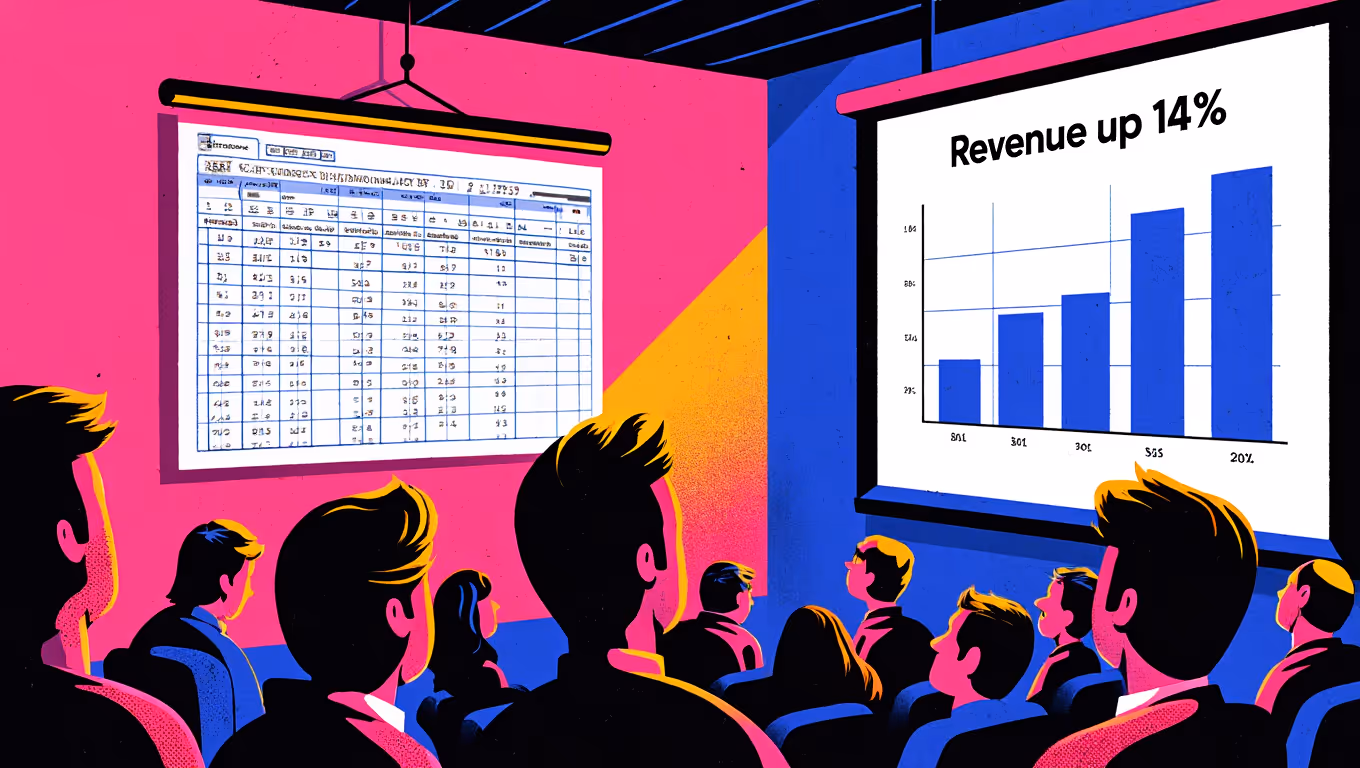
This sounds obvious, but look at most business presentations and you'll see the opposite. Complex charts with multiple data series, dual axes, colour-coded legends with eight categories, and a title that says something vague like "Revenue Overview." The chart contains the insight somewhere, but the audience has to do the analytical work to find it.
Compare that with a slide titled "Revenue grew 14% quarter-on-quarter" featuring a clean, simple chart that shows exactly that trend. The insight is immediate. The audience absorbs it in a glance and is ready for the next piece of your argument.
This approach requires more slides, yes. But more simple slides are always better than fewer complex ones. Your audience's attention is finite. Respect it.
Choosing the right chart (and when to skip charts entirely)
Not every data point needs a chart. Sometimes a single number, displayed large and bold, communicates more effectively than any visualisation could.
If your key message is "Customer satisfaction is at 92%," you don't need a bar chart. You need a big "92%" with a short line of context underneath. The impact is immediate and unmistakable.
For data that does warrant a chart, the choice of chart type matters more than most people realise.
Bar charts are your workhorse for comparing categories. Revenue by region. Spend by department. Performance by team. Horizontal bar charts are particularly good when you have long category labels or more than five or six items, as they're easier to read than vertical bars in those situations.
Line charts show change over time. They're the right choice when the trend matters more than individual data points. Keep them simple: one or two data series maximum. If you need to show more, break it into multiple slides.
Pie charts are almost always the wrong choice. I know that's a strong statement, but I'll stand by it. Pie charts ask your audience to compare areas of differently shaped segments, which humans are notoriously bad at. We can't accurately judge the difference between a 23% slice and a 27% slice by looking at a pie chart. A simple bar chart or even a table with percentages does the job better in almost every scenario. The rare exception is when you're showing a simple two-way or three-way split where the proportions are dramatically different.
Scatter plots, waterfall charts, and more exotic visualisation types have their place in analytical presentations. But for most business communication, clarity beats sophistication. If your audience needs a legend to understand the chart, the chart is probably too complex for a presentation slide.
Design principles that make data clear
Good data visualisation in presentations follows a few core design principles.
Remove everything that doesn't contribute to understanding. Gridlines? Remove them (or make them very faint). Axis labels for every data point? Only if they add information the audience needs. Borders around the chart? Almost never necessary. The design term for this is reducing "chart junk," and it's the single biggest improvement most people can make to their data slides.
Use colour with purpose. Colour should draw attention to the insight, not decorate the chart. If your key message is that one region outperformed the others, make that region's bar your primary brand colour and everything else a neutral grey. The eye goes straight to the story. If every bar is a different colour, nothing stands out and the audience has to work harder to find the point.
Annotate the insight. Don't make the audience hunt for the takeaway. Add a short text callout pointing to the specific data that supports your argument. "Up 14% vs. last quarter" with an arrow to the relevant bar tells the audience exactly what to look at and what it means. This is particularly important for leave-behind decks where the presenter isn't there to point at the screen and say "look at this."
Maintain consistent scales. If you're comparing data across multiple slides, keep your axes consistent. Nothing undermines trust faster than a chart that makes a 2% change look like a cliff because the y-axis starts at 98%. Honest scales build credibility. Manipulative scales get noticed.
Building data storytelling into your templates
Here's where this connects back to how your organisation actually produces presentations.
Most people don't have a strong background in data visualisation. They know they need to show data, so they use whatever PowerPoint's default chart settings give them. The defaults are... fine. They work. But they rarely produce the kind of clean, purposeful data visualisation that makes presentations sing.
This is where template architecture matters. A well-designed PowerPoint template can include pre-formatted chart styles that match your brand and follow good visualisation principles. Custom chart colour palettes that use your brand colours with appropriate neutral tones for de-emphasis. Slide layouts specifically designed for data, with space for a clear insight title, a chart area, and an annotation zone.
When the default chart style in your template already removes unnecessary gridlines, uses your brand colours appropriately, and is sized correctly within a layout that includes space for an insight callout, every chart anyone creates starts from a much better place. The person inserting the chart doesn't need to know the principles of data visualisation. The template guides them towards good practice automatically.
This is the same principle that applies to brand governance (making good practice the default) applied specifically to data communication. And it works. Organisations that invest in data-optimised presentation templates see a noticeable improvement in the quality of data slides across the board, without needing to train every employee in Edward Tufte's principles.
The audience perspective
Put yourself in the shoes of the person viewing your presentation. They're probably seeing six or seven presentations this week. They're making decisions based on the information you're presenting. They have roughly 30 seconds per slide to absorb the message before you move on (or before they swipe to the next slide, if they're reading asynchronously).
In those 30 seconds, a well-crafted data slide communicates: "Here's what happened, here's what it means, here's what you should care about." A poorly crafted data slide communicates: "Here's a bunch of numbers. Good luck."
The difference between those two experiences isn't talent. It's structure. It's having the right templates, the right chart formats, and the right design principles built into the tools people use every day.
If your organisation's presentations are still in the "screenshot the spreadsheet" phase, it might be time for an upgrade. Our free Template Health Check gives you a quick picture of where your presentation templates stand, including how well they support data visualisation and storytelling.


RAVE REVIEWS
who we work with


.svg)
.svg)
.svg)
.svg)


