Visual Storytelling in the Age of TikTok Attention Spans: Adapting Corporate Communications for 2026

The average human attention span has dropped to 8.25 seconds. A goldfish clocks in at nine. Somewhere between the rise of six-second Vines and the endless scroll of TikTok, we collectively lost our ability to sit through anything longer than a microwave countdown.
For marketing teams, communications directors, and brand managers, this presents a genuine challenge. The same audience members who will happily spend 35 hours per month scrolling through short-form videos are the ones you need to engage with quarterly reports, investor presentations, and corporate communications. They are conditioned to expect instant gratification, visual impact, and content that earns their attention in the first three seconds.
The good news is that corporate communications can absolutely thrive in this environment. The secret lies in visual storytelling - designing presentations, documents, and templates that work with shrinking attention spans, delivering information in ways that feel intuitive and engaging.
The TikTok Effect on Workplace Expectations
Research from Microsoft found that after just 20 minutes on TikTok, users experience measurable decreases in attention span and working memory. The platform's algorithm-driven content removes decision-making from the equation entirely. Open the app, receive a reward. The brain loves this unpredictability, much like a slot machine that occasionally delivers a winner.
This conditioning does not switch off when someone walks into the office or opens their laptop for a virtual meeting. The same people who find videos longer than one minute stressful (nearly 50% of TikTok users, according to platform surveys) are sitting in your presentations, reviewing your documents, and processing your internal communications.
Consider the implications for your next quarterly update or investor presentation. Your audience has spent their commute scrolling through perfectly curated 30-second videos. Their brains have been trained to expect instant payoff. They walk into your meeting and encounter a 47-slide deck with walls of text. The cognitive dissonance is real - and so is their disengagement.
Gen Z and Millennial employees now make up the majority of many corporate workforces. They have grown up with content that gets straight to the point. Lengthy text blocks, dense bullet points, and static slide after static slide feel outdated to them - like receiving a fax when everyone else is sending voice notes.
This shift reflects a deeper understanding of how people process information. Designing materials that respect your audience's time while delivering your message effectively is simply smart communication strategy.
What Visual Storytelling Actually Means for Business
Visual storytelling in a corporate context means structuring information so that every element - text, imagery, data, and white space - works together to guide the viewer through a clear narrative. Adding stock photos to a PowerPoint is a start. The full approach goes much further.
The human brain processes visuals 60,000 times faster than text. When you present information visually, you align with your audience's natural cognitive preferences. Data storytelling, in particular, has evolved from a nice-to-have into a fundamental business communication skill.
Traditional approaches - dense spreadsheets, complex charts with twelve data points competing for attention, and slides that require five minutes of explanation - are rapidly losing effectiveness. Clean infographics, animated data visuals, and narrative-driven charts are becoming the standard for professional communication.
This matters especially in high-stakes environments. Boardrooms, investor meetings, and client presentations are where clarity and context drive decisions. If your audience cannot grasp your key message within the first few seconds, you have already lost ground.
Presentation Design Trends Shaping 2026
Several significant trends are reshaping how businesses approach presentation design. Understanding these shifts helps marketing and communications teams stay ahead of audience expectations.
Data Storytelling Over Data Dumping
The era of the 100-chart market review is ending. Forward-thinking presentations now structure data as a narrative arc: challenges first (using overview charts to show key indicators), then insights (allowing audiences to identify patterns through interactive elements), and finally solutions (displaying improvement plans with projected outcomes).
This approach transforms passive viewing into active engagement. Your audience stops waiting for you to explain the slide and starts discovering the story within the data themselves.
Dark Mode and Eye-Friendly Design
Screen fatigue is real. With more presentations viewed on monitors, laptops, and mobile devices than ever before, dark-themed designs have moved from aesthetic preference to functional necessity. High contrast themes reduce eye strain and make accent elements pop.
Bright accent colours against dark backgrounds create visual interest without overwhelming viewers. This approach works particularly well for presentations delivered in dimly lit conference rooms or shared via screen during virtual meetings.
Motion and Micro-Interactions
Static slideshows are giving way to dynamic experiences. Subtle animations, interactive elements, and hover-triggered content transform passive viewing into active engagement. When a chart builds piece by piece or a key statistic animates into view, the audience's attention naturally follows.
This is particularly powerful for investor presentations, training materials, and product launches where maintaining engagement determines success.
The key is restraint. Animation for the sake of animation becomes distracting. Every motion should serve the narrative - drawing attention to important information, creating visual hierarchy, or smoothing transitions between concepts. When done well, the audience does not consciously notice the animation. They simply find the presentation easier to follow and more engaging.
Magazine-Style Layouts
Asymmetric layouts, layered typography, and strategic white space are becoming the new standard for professional presentations. The result feels modern, editorial, and sophisticated - much closer to a well-designed report.
This trend rewards simplicity. Fewer elements, more impact. Each slide serves a single purpose, delivering one clear message with visual clarity.
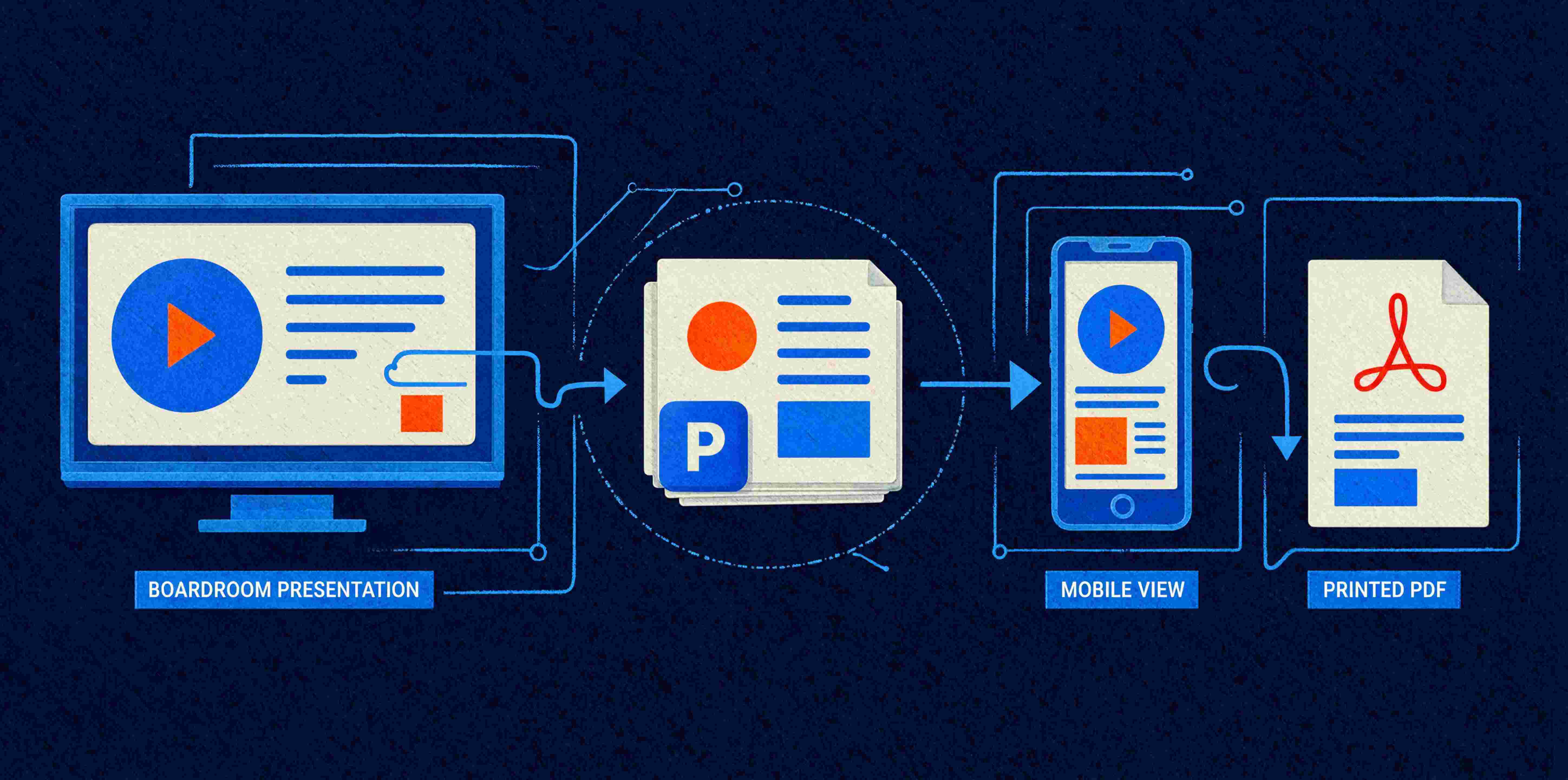
Mobile-First Thinking
More people view presentations on phones and tablets than ever before. Slide designs that look stunning on a large screen can become illegible on a mobile device. Building mobile-friendly templates ensures your content works across every viewing context.
This includes considering font sizes, touch-friendly navigation, and layouts that adapt gracefully to smaller screens.
Accessibility as Standard Practice
2026 presentations also need to consider accessibility from the ground up. High contrast ratios, readable font sizes, alt text for images, and logical reading order are becoming baseline expectations. Accessible design benefits everyone, including those with specific vision or cognitive requirements.
Inclusive presentation design often overlaps with good visual storytelling practice. Clear visual hierarchies, uncluttered layouts, and thoughtful colour choices improve the experience for all viewers while meeting accessibility standards.
The Role of Professional Templates in Visual Communication
These trends sound impressive. Implementing them consistently across a business presents unique challenges. Marketing teams create presentations. Sales teams build pitch decks. Investor relations prepare quarterly updates. Finance produces reports. Each department has different skill levels, time pressures, and design sensibilities.
This is where professional Microsoft Office templates become essential infrastructure.
A well-designed custom PowerPoint template system ensures that every presentation, regardless of who creates it, maintains brand consistency and follows visual storytelling principles. Pre-built layouts accommodate different content configurations - whether you need four bullet points or twelve - while maintaining proper spacing and visual balance.
Professional Word document templates apply the same principles to written communications. Style hierarchies guide users toward consistent formatting. Content controls expand and contract based on text length. The document looks polished whether the team member is a design natural or struggles to change a font.
These systems remove the friction between wanting great visual communication and actually producing it. Your team stops fighting with formatting and starts focusing on the message.
The productivity gains are substantial. When a sales manager can build a professional pitch deck in 30 minutes instead of three hours, those saved hours go toward client relationships and strategic work. When a marketing coordinator can update quarterly results without redesigning each slide from scratch, the team maintains momentum instead of getting bogged down in production tasks.
Common Pitfalls in Visual Communication
Before exploring solutions, it helps to understand what typically goes wrong. Many businesses recognise their presentations and documents are underperforming. They struggle to pinpoint exactly why.
The Text Wall Trap
Slides crammed with bullet points force audiences to choose between reading the screen and listening to the presenter. This creates cognitive dissonance and dramatically reduces information retention. When a speaker simply reads their slides aloud, they add little value - the presentation becomes redundant.
The fix is straightforward: slides exist to support verbal communication. Key messages belong on the slide. Supporting detail belongs in the speaker notes or delivered verbally. This single shift transforms how audiences engage with your content.
Inconsistent Brand Application
Different team members produce materials that look vaguely similar and never quite match. Logos appear in different sizes and positions. Colour palettes drift. Fonts vary from presentation to presentation. The cumulative effect undermines professional credibility and makes your business look less organised than it actually is.
A comprehensive Microsoft template design system eliminates this problem at the source. When every team member starts from the same professionally designed foundation, consistency becomes the default.
Design Complexity Without Purpose
Some businesses overcorrect in the opposite direction - adding complex animations, elaborate graphics, and trendy design elements. These elements look impressive and actually hinder communication. Visual storytelling means making information clearer.
Effective design serves the message. Every visual element should either enhance understanding, reinforce brand identity, or guide the viewer's attention. Elements that do none of these things are candidates for removal.
Building Visual Storytelling into Your Template Strategy
The most effective approach to modernising corporate communications combines three elements: strategic template design, clear brand guidelines, and practical training.
Template Structure That Supports Narrative
Your PowerPoint templates should include layouts that naturally guide presenters toward storytelling. Section divider slides create visual breathing room between topics. Data-focused layouts provide space for single, impactful statistics with visual clarity. Image-heavy options allow for emotional impact without sacrificing professionalism.
Master slides do the heavy lifting so individual users can focus on content. Predetermined colour palettes, logo placements, and typography eliminate the daily decisions that lead to inconsistency.
Brand Guidelines That Enable Creativity
Effective brand guidelines for visual storytelling are permissive. They provide a framework that teams can work within confidently. Clear direction on when to use certain layouts, which colours work for different purposes, and how much text is appropriate per slide gives users creative freedom within defined boundaries.
The goal is templates your team will actually use. Overly rigid systems get abandoned. Flexible systems that make good design easier than bad design get adopted enthusiastically.
Training That Sticks
Even the best templates need some explanation. Quick reference guides showing before-and-after examples help teams understand why certain approaches work better. Short training sessions focusing on practical application - this is how you choose between layouts, this is where your logo goes, this is why less text works better - build capability without overwhelming.
The most effective training connects back to the audience attention challenge. When your team understands that their viewers have goldfish-level focus, they become invested in designing communications that work harder in less time.
What This Means for Executive Communications
Investor presentations face particularly high expectations. Your audience includes financially sophisticated professionals who review dozens of decks and reports. Standing out requires visual clarity and narrative structure that respects their expertise while making complex information accessible.
Quarterly reports that combine data storytelling with clean visual design communicate competence and transparency. Pitch decks that lead with compelling visuals and support with data perform better across virtually every metric.
Executive communications - whether internal updates, board presentations, or industry keynotes - benefit from the same principles. The senior leaders in your business represent your brand visually as well as verbally. Providing them with professional, on-brand materials ensures consistency across every touchpoint.
Measuring the Impact of Visual Communication Improvements
The benefits of stronger visual storytelling are measurable, even if the metrics are not always immediately obvious.
Engagement indicators provide early signals. Are audiences asking questions during presentations, or checking their phones? Do meeting follow-up conversations reference specific points from your materials, suggesting the content was memorable? Are clients and stakeholders requesting copies of your decks and documents?
Business outcomes tell the fuller story. Sales teams using professionally designed pitch decks typically report improved close rates. Investor presentations that tell a clear visual story generate more substantive follow-up conversations. Internal communications that respect employees' attention earn better engagement with company initiatives.
Time savings compound quickly. When template systems eliminate the daily formatting struggle, teams reclaim hours each week. Across a department, across a year, those hours represent significant productivity gains and reduced frustration.
Brand consistency builds cumulative value. Every professional touchpoint reinforces your positioning. Every inconsistent document erodes it. Over time, the businesses that present themselves coherently develop stronger brand equity and greater stakeholder trust.
The Practical Path Forward
Adapting to shortened attention spans allows you to maintain depth and substance while rethinking delivery. Visual storytelling principles align with human cognition. Professional template systems make those principles accessible to everyone in your business, including team members with limited design experience.
The companies that will communicate most effectively in 2026 and beyond are those investing in this infrastructure now. They are auditing their existing materials, identifying where visual storytelling could improve engagement, and building template systems that scale across departments.
The investment pays dividends across multiple dimensions. Teams work faster with less frustration. Brand consistency improves without requiring constant oversight. Professional quality becomes achievable for everyone, regardless of their design background. And communications actually achieve their intended purpose - informing, persuading, and engaging audiences whose attention is increasingly precious.
Making the Transition
Updating your approach to corporate communications does not require a complete overhaul overnight. Many businesses find success with a phased approach: start with the highest-impact materials (typically investor presentations and sales decks), refine the system based on user feedback, then expand across other document types and departments.
The key is beginning with a clear understanding of where you currently stand. Which templates and materials are working well? Which consistently cause problems? Where do team members spend excessive time on formatting that could be better spent on content and strategy?
This kind of honest assessment reveals priorities and helps focus investment where it will deliver the greatest return.
Where Ideaseed Fits In
We specialise in creating Microsoft Office template systems that bring visual storytelling principles to life within the tools your team already uses. Our custom PowerPoint designs, professional Word document templates, and comprehensive Microsoft 365 template solutions help businesses communicate with clarity, consistency, and impact.
Whether you need a complete template overhaul, a refresh of your existing presentation assets, or guidance on bringing your corporate communications into 2026, we can help.
Our free template audit is a straightforward way to understand where your current materials stand and what improvements would make the biggest difference. The questionnaire takes just a few minutes, and you will receive actionable insights about your Word and PowerPoint templates.
Take the first step toward communications that align with modern attention spans. Complete our free template health check HERE and find out how your templates measure up.


RAVE REVIEWS
who we work with


.svg)
.svg)
.svg)
.svg)


