Your Slide Master Is the Most Important Slide You Never Look At

There's one slide in your PowerPoint deck you've probably never looked at on purpose. You can't see it in the normal view. It doesn't appear when you present. And yet it controls more about how your presentation looks, holds up, and behaves than every visible slide combined. It's the Slide Master, and it's the most important slide you never look at.
If your decks keep drifting off-brand, breaking when someone else edits them, or fighting you every time you try to make a global change, the Slide Master is almost always where the answer lives.
What is the Slide Master?
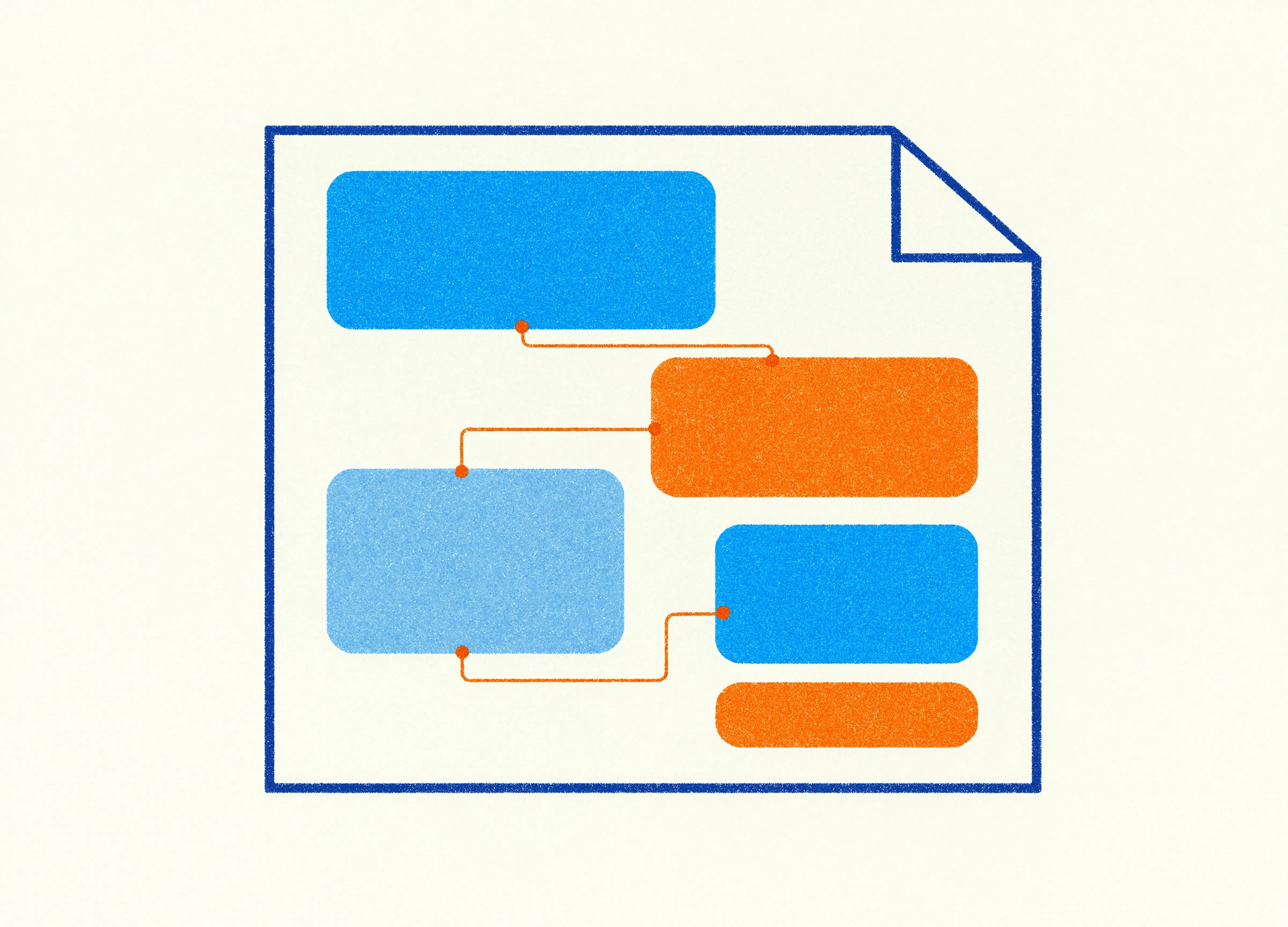
The Slide Master is the hidden top layer of a PowerPoint presentation that controls the design of every slide beneath it. It sets the fonts, colours, placeholder positions, background and layout options that all your slides inherit. Change something on the master, and it ripples through the whole deck at once. Think of it as the architectural drawing behind the building, you don't live in it, but everything you do live in was shaped by it.
Underneath the master sit the individual layouts: title slide, section divider, two-column, content-with-image and so on. Each layout is a set of instructions for a type of slide. When the master and its layouts are built properly, your presentation has a backbone. When they're ignored, every slide is freelancing, and it shows.
Why does it matter so much?
Because almost every presentation problem businesses complain about traces back to it.
Decks that won't stay on-brand? Usually because the brand fonts and colours were applied slide by slide instead of being set once on the master, so the moment someone edits, the discipline collapses. Presentations that look different depending on who touched them last? Same cause. A deck that takes a full afternoon to update when the logo changes? That's the absence of a master doing its job, you're now changing fifty slides by hand instead of one master once.
A well-built master means a change made once flows everywhere it should. A new brand colour, an updated logo, a tweak to the heading font, you make it on the master and the whole deck follows. That's not a nice-to-have. For a business producing presentations at any volume, it's the difference between minutes and days.
Why do presentation templates break when other people edit them?
This is the question we hear most, and the Slide Master is the answer. A presentation breaks under editing when its content lives outside the master structure.
The pattern is always the same. The original deck looks lovely. Then it gets shared. The next person needs to add a slide, so instead of choosing a proper layout, they duplicate a slide and start dragging text boxes around. They paste in content from another deck, bringing its formatting with it. They nudge things to make them fit. None of this content is connected to the master, so none of it inherits the design rules. Each edit is a small act of freelancing, and they accumulate. A few rounds later the deck is a patchwork, and no global change can fix it because half the content isn't listening to the master anymore.
A properly structured master with proper placeholders gives editors a track to run on. When they add a slide, they pick a layout, the placeholders are already positioned and styled, and they just drop content in. The design holds because the structure does the work, so it no longer rests on the willpower of whoever's editing at 4pm on a Friday.
The Slide Master in the age of Copilot
This has become more relevant than ever now that AI has moved into PowerPoint. Microsoft recently gave Copilot the ability to standardise fonts, font sizes and bullet styles across an entire presentation in a single pass. It's a useful feature. Tell Copilot to tidy and align a deck, and it'll bring everything into line.
Except it can only do that cleanly when there's a structure to align things to. Copilot reads the placeholders set up in the Slide Master and works with them. What it struggles with is the freeform text boxes people have added to individual slides, outside the master, because those float free of the design system. So the better your master is built, the better Copilot performs. The same structure that helps a human editor keep a deck on-brand is the structure that lets AI do it at speed. A messy deck doesn't just confuse your colleagues, it now confuses your AI too.
That's worth sitting with for a moment. The unglamorous, invisible work of building a proper master has quietly become the thing that determines whether your shiny new AI tools actually help you or just spread the mess faster.
What a well-built master actually contains
You don't need to become a PowerPoint engineer, but it helps to know what "good" looks like so you can tell whether yours measures up.
A solid master has its fonts and colours defined at the theme level, so they're the single source of truth for the whole deck. It has a considered set of layouts that match how your business actually presents, somewhere between the bare two defaults and the bloated forty near-identical ones nobody can choose between. Its placeholders are positioned with intent, so titles, body content and images land consistently from slide to slide. And its layouts are named for what they are, so anyone building a deck knows which one to reach for.
Get those right and the master becomes invisible in the best way. Nobody thinks about it, because nothing's going wrong. Decks stay on-brand without anyone policing them, edits hold up, and global changes take a minute. That's the quiet luxury of good structure.
How to take a quick look for yourself
You can get a feel for the state of your own master in about two minutes, no expertise required. In PowerPoint, go to the View tab and choose Slide Master. The view that opens shows the master at the top and its layouts beneath. Have a look at how many layouts there are and whether their names mean anything. A handful of clearly named layouts is a good sign. Forty cryptic ones, or just the bare defaults, suggests the master was never really set up for how your business works.
Then close that and open a few decks your team has actually produced. On a content slide, click once on a block of text. If it sits in a tidy placeholder that lines up with other slides, the structure is doing its job. If you find loose text boxes scattered at slightly different positions on every slide, you've found why your decks drift and why global changes are such a chore. That scatter is also exactly what trips Copilot when it tries to restyle the deck.
None of this commits you to fixing anything. It just tells you whether your presentations are built on a backbone or held together by habit. Once you've seen it, you can't unsee it, which is rather the point.
The thing to take away
The Slide Master is where presentation design stops being decoration and starts being engineering. It's the difference between a deck that looks good once and a template that keeps looking good through a hundred edits by a dozen people. Beautiful slides that fall apart the moment someone touches them aren't really finished, they're just photogenic.
If your presentations keep drifting, breaking or eating your time, the fix probably lives on the one slide you've never looked at, well out of sight of the ones you have. And building that one properly is exactly the sort of thing that turns an ordinary template into one you can actually rely on.
Nat is a designer at Ideaseed specialising in presentation design, graphic design, document design and accessible content. Nat brings a design-first eye to the technical backbone of Ideaseed's work, making sure every template looks as good as it functions, right down to the Slide Master nobody else thinks to check.
Wondering whether your presentation templates are built to last? Start with our free template health check: ideaseed.com.au/questionnaire.
Need a branded template? We can turn it around overnight.
Australia's Microsoft Office template specialists with a South Africa team that delivers while you sleep.

RAVE REVIEWS
who we work with


.svg)
.svg)
.svg)
.svg)