The Chart That Explains Itself: Data Storytelling in Slides Without the Spreadsheet Screenshot
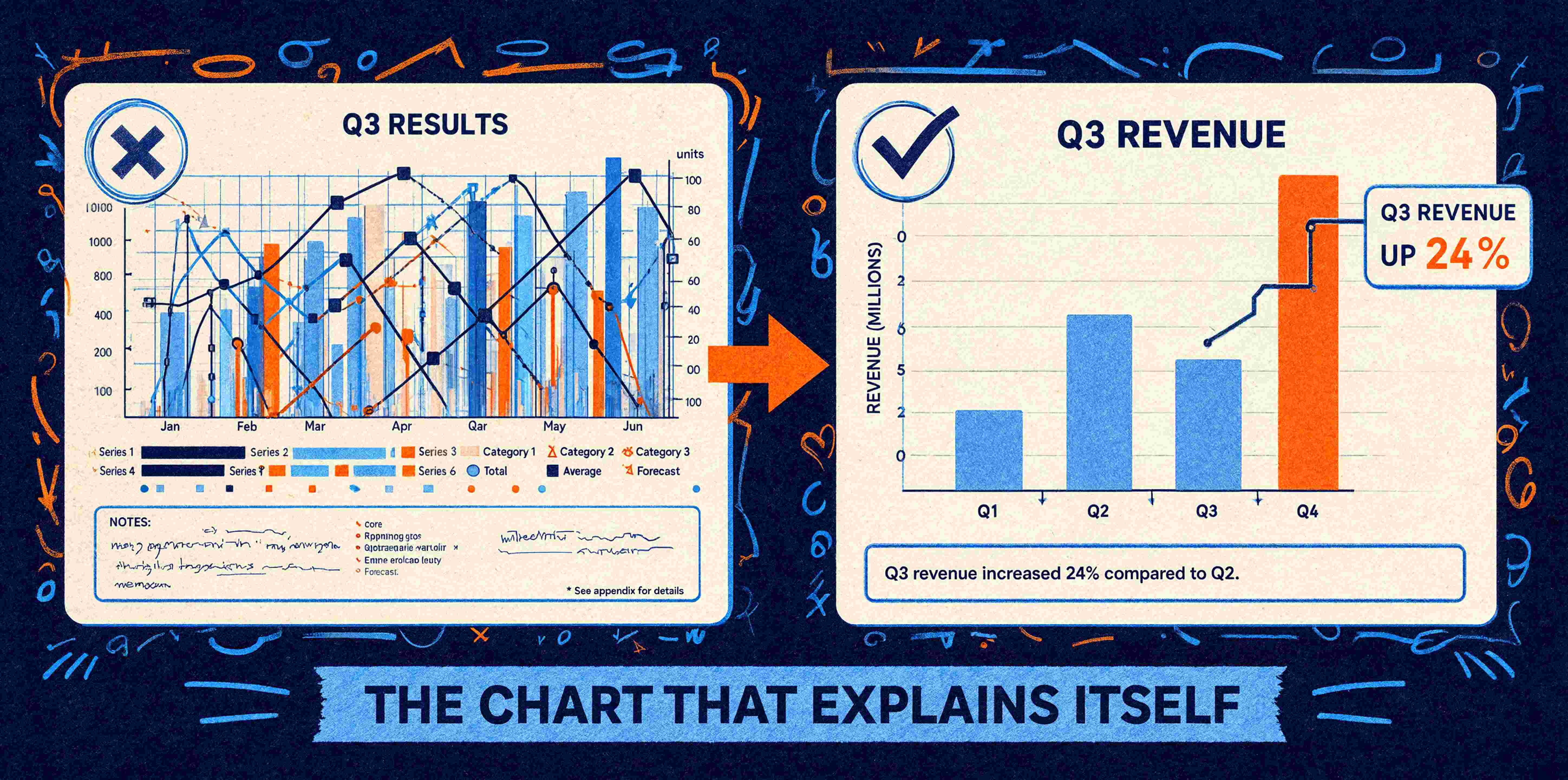
You know the slide. A chart pasted straight out of Excel, six data series in six colours, a legend nobody can read, a title that says “Q3 Results” and nothing else. The presenter clicks to it, says “as you can see here,” and absolutely no one can see anything. The audience spends the next thirty seconds decoding the chart instead of listening to the point.
The way businesses put data on slides is changing in 2026, and it's a change worth paying attention to. The shift is away from showing the numbers and towards explaining what the numbers mean. Designers call it narrative scaffolding: building the chart so it tells the story on its own, rather than dumping the raw data and hoping the audience does the interpreting. Done well, the chart explains itself.
What is data storytelling?
Data storytelling is the practice of designing a chart or data slide around a single clear insight, so the audience grasps the point at a glance instead of having to analyse the data themselves. The chart doesn't just present information. It makes an argument. One slide, one insight, made obvious.
The contrast is with data visualisation in the old sense: technically showing the numbers, accurately, comprehensively, and leaving the meaning entirely up to the viewer. Accurate, but useless in a presentation, because your audience has about three seconds of attention per slide and no appetite for homework.
One slide, one point
The discipline that fixes most data slides is brutal simplicity: each chart earns its place by making one point. If a chart needs a paragraph of explanation to be understood, it's trying to do too much, and it should be two charts or none.
Start from the insight and let the data follow. What's the one thing this slide needs to land? Revenue's up in one region and flat everywhere else? Then build the chart around that comparison and strip everything that doesn't serve it. The other five data series you were tempted to include aren't supporting your point. They're burying it.
Let colour do the pointing
Colour is the most wasted tool in data slides. Most charts use it as decoration: every bar a different colour because the software did that automatically. Used with intent, colour directs the eye to exactly what matters.
Highlight the one bar, the one line, the one segment that carries your point, and let everything else sit back in a neutral tone. Suddenly the audience looks where you want them to look, immediately, without you saying a word. Keep that colour logic consistent across every chart in the deck so viewers don't have to relearn the visual language on each slide. This is where brand colours and a well-defined template palette do quiet, useful work: the accent colour that means “look here” stays the same throughout, because it's built into the template rather than chosen afresh each time.
Add the callout that does the interpreting
The single highest-value addition to most data slides is a plain-language callout: a short line, right on the chart, that states the takeaway. Not “Q3 Results” but “Q3 revenue up 24%, driven entirely by the new region.” The chart shows it. The callout says it. Between them, the audience gets the point whether they study the data or not, which matters enormously when the slide later goes out as a silent PDF and there's no presenter to explain anything.
Why the screenshot is the real villain
Which brings us to the pasted Excel image, the habit worth breaking first. When you screenshot a chart and drop it onto a slide, you get a dead object. It pixelates when the slide is shown at full size or exported to PDF. It can't inherit your brand colours or fonts. It can't be edited when the number inevitably changes, so someone re-screenshots, and the new image doesn't match the old formatting, and the deck drifts.
Native charts, built properly into the template, behave. They pick up the brand palette, they stay crisp at any size, and they update when the data does. The storytelling survives editing because the chart is a living part of the slide rather than a photograph of one. That's a template build decision as much as a design one: chart placeholders and styles set up so that the person assembling the deck falls into doing the right thing rather than reaching for the screenshot.
Where the craft still lives
Templates and AI tools can get you consistent, clean, on-brand charts, and that's a solid baseline every deck should have. The judgement of which insight to feature, how to frame it, and what to cut, that's the designer's craft, and it's the part that turns a competent data slide into a persuasive one. The tools handle the tidiness. A human decides what the story is.
The next time you're tempted to paste a chart straight from the spreadsheet, stop and ask what single point it's meant to make. If you can't answer in one sentence, the slide isn't ready, no matter how much data is on it.
Nat is a designer at Ideaseed specialising in presentation design, data visualisation, graphic design and accessible content. Nat brings a design-first eye to Ideaseed's template work, making sure every slide looks as good as it functions and says what it's meant to say.
Want data slides that make the point instead of hiding it? Our free template health check will show you where your presentation template could work harder.
Need a branded template? We can turn it around overnight.
Australia's Microsoft Office template specialists with a South Africa team that delivers while you sleep.


RAVE REVIEWS
who we work with


.svg)
.svg)
.svg)
.svg)