One Deck, Three Shapes: Designing Presentations for the Screen, the Phone and the Print-Out
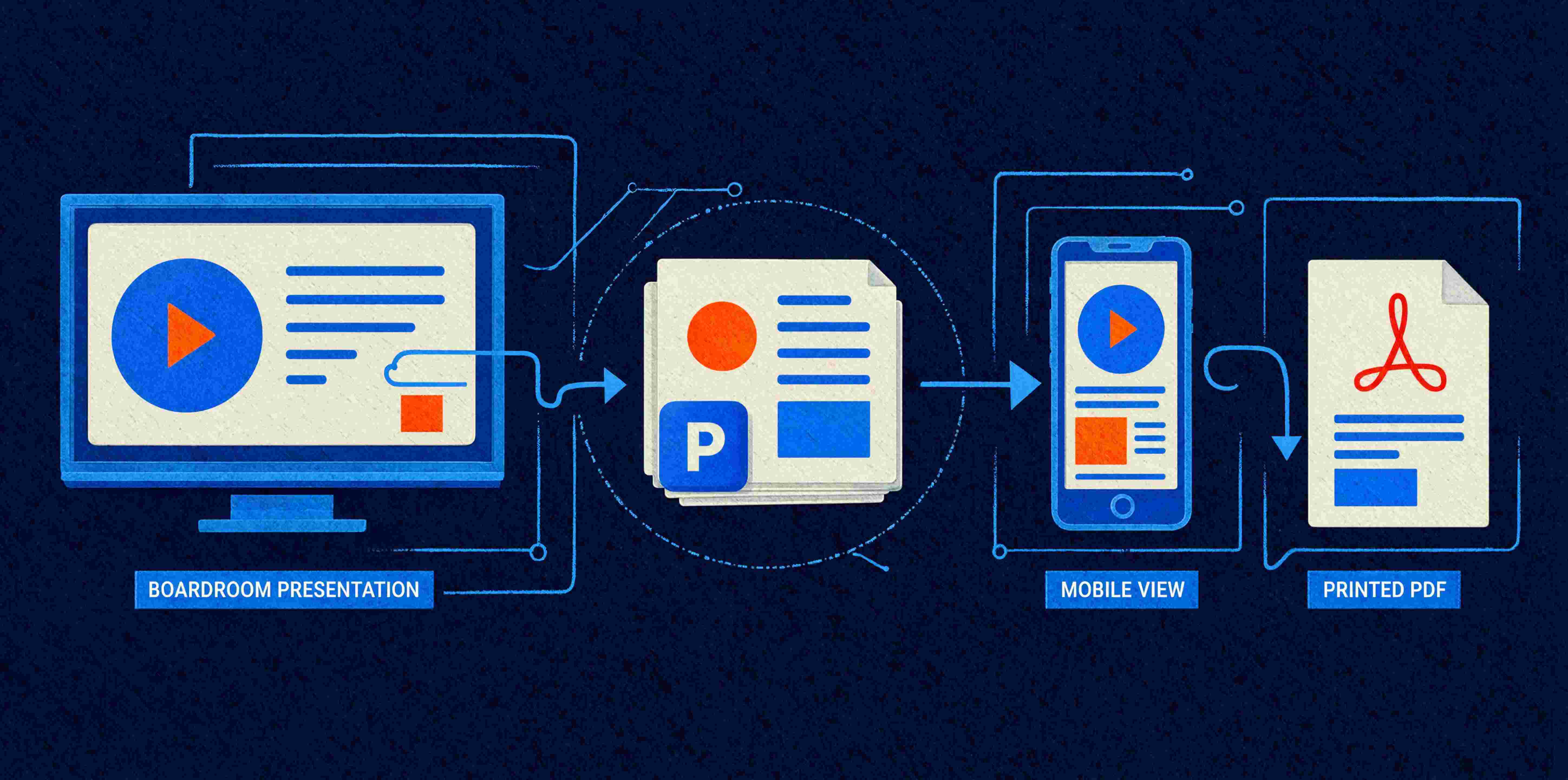
Picture the life of a single investor deck. On Monday it's up on a boardroom screen, big and cinematic, you talking over it. On Tuesday your CFO forwards it to a board member who reads the whole thing on their phone in the back of a taxi. On Wednesday someone prints it to PDF and emails it round as a leave-behind. Same file. Three completely different jobs.
Most presentation templates are built for exactly one of those situations, usually the first, and they fall apart in the other two. The text that looked perfect on the big screen is unreadable on the phone. The slide that made sense while you narrated it makes no sense at all as a silent PDF. This is the design challenge of 2026, and the industry has a name for it now: the hybrid deck.
What is a hybrid deck?
A hybrid deck is a single presentation designed to work across multiple contexts: presented live in 16:9, read on a mobile screen, and shared as a static document, without being rebuilt from scratch for each one. It's the recognition that your deck no longer lives in one place. It's presented, skimmed, forwarded and printed, often all in the same week, and it needs to hold up every time.
The old assumption was that a slide is something a presenter stands next to and explains. That assumption is gone. Executives read decks between meetings on their phones. Boards receive them as PDFs. Half your audience will never see you present at all. A deck now has to carry its own meaning when you're not in the room.
Why one deck can't just be three files
You might reasonably say: fine, I'll make three versions. A screen version, a mobile version, a print version. And for a truly high-stakes deck, sometimes a bespoke vertical version is worth it. But as a standing approach, three separate files is a maintenance nightmare. The moment a number changes, you're updating it in three places, and by the third revision the versions have drifted apart. Someone always presents the wrong one.
The better answer is a template built so that one deck adapts gracefully. That's less about clever trickery and more about disciplined architecture: the same structural thinking that separates a template that scales from one that collapses the moment real life touches it.
Designing for the screen without breaking the phone
The single most useful move is to design your 16:9 deck to survive being shrunk. That means type that's large enough to read at a fraction of its intended size, strong contrast so text holds up on a phone in daylight, and generous spacing so nothing turns to mush when the slide is four inches wide.
A boardroom screen forgives small, elegant type. A phone does not. When you build the template, set your body text with the phone in mind rather than the projector. Titles want to be large and confident, body text legible at a distance and at thumbnail size both. If a label can't be read without pinching to zoom, it's too small, and the fix belongs in the template's styles, well before anyone reaches a frantic edit the night before.
Designing for the print-out without a presenter
The silent PDF is where most decks fall down hardest. A slide that's a single striking image and three words is magnificent when you're there to explain it. As a leave-behind, it says nothing. The board member reading it later has no idea what those three words meant.
The trick is to build in a layer of meaning that only fully shows itself when there's no narrator. Speaker notes that carry the argument. A clear headline on every slide that states the point rather than just labelling the topic. A structure that reads as a document in its own right, rather than a set of cue cards. When the template is built with the leave-behind in mind, the same slides that work live also work in silence, without you cluttering the on-screen version to compensate.
Where the template architecture earns its keep
All of this is a build problem before it's a design problem. The layouts have to be structured so the deck holds its shape when content changes. The styles have to be defined so type sizes and colours stay consistent across every slide and every context. Charts need to be native and editable rather than pasted images that pixelate the moment someone views the PDF at full size. And the whole thing needs to export cleanly, which is its own small art.
Get the architecture right and one file serves all three purposes without fuss. Get it wrong and you're back to three drifting versions and the wrong one on screen. This is the unglamorous, technical backbone that we spend our days on, and it's what turns a nice-looking template into one that survives contact with a real business.
The honest limit
A well-built hybrid template gets you a deck that works across screen, phone and print. It won't, on its own, make the deck brilliant. The story still needs shaping. The one chart that carries your whole pitch still needs a designer's eye. AI tools and smart templates can get you to clean and consistent across every format, and that's worth a lot. The leap from clean to memorable is still a human one. We build both sides of that, because in practice you need both.
If your current template only really works in one of the three situations your decks actually end up in, it's doing about a third of its job.
Georgie is co-founder of Ideaseed, with more than 25 years in Microsoft Office template design, presentation design and automation. She and her team build enterprise templates that bridge design vision and technical reality for businesses worldwide.
Wondering whether your presentation template holds up across the screen, the phone and the print-out? Our free template health check is a good place to start.
Need a branded template? We can turn it around overnight.
Australia's Microsoft Office template specialists with a South Africa team that delivers while you sleep.


RAVE REVIEWS
who we work with


.svg)
.svg)
.svg)
.svg)